


As we go throughout our day, countless things will typically impact on our mood and on our psychology. You might find for instance that what you eat alters your temper (bananas contain dopamine and so can put you in a good mood), or that the amount of sleep you get dictates whether or not you’re in good spirits for the rest of the day.
What might come as a surprise though, is to learn that even the colours you see as you go about your routine can have an impact on your mood. Here we will look at why that is, and at how you can use it to your advantage.
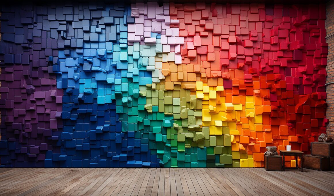
Relaxing Colours
The most direct and immediate way in which colours can impact our psychology and even our physiology, is in the way they affect our calmness. The colours blue and green for instance, are known to make us feel more relaxed and at ease, and that’s why they’re so commonly used in web design, in shop layouts and in offices. If you want someone to stay on your website, or to work more effectively without dreading being there, then using blues and greens can help to make them feel at ease.
This has an even more profound effect for business owners and managers too, because by making us feel more relaxed, blues and greens can also help to increase our creativity. Studies have shown, that when you are in a blue or green room, or even just leaning back slightly, you are better at coming up with creative solutions to problems. This is possibly because adrenaline and other stress hormones cause a ‘tunnel vision’ effect in the way we think.
But why do these colours have such a calming effect? Well one explanation is that it’s to do with our evolutionary heritage. If you think about the way we lived when we were in the wild, then it makes sense that we would have felt relaxed when we were in locations with ample resources. A lush forest would have provided food, shelter and water, and so it makes sense that we would have developed a fondness for the associated colours. Even better than including a green painting in your office is to include an actual plant, and it’s no wonder that TV shows have ‘green rooms’ to help keep contestants calm while they wait to go on.
Interestingly, green is also one of the rarest colours in the ‘real world’, which is why green screens are common for special effects…
Aggression
On the other end of the spectrum, some colours can have the complete opposite effect on our psychology and cause us to feel more anxious and stressed – and even to become more aggressive and confrontational.
Those colours are red and orange, which interestingly are actually opposite green and blue on the colour wheel. This is unlikely to be the only reason we have this adverse reaction though – again it’s probably also down to our evolutionary psychology. When we were still evolving, a lot of our biggest threats would have been red and orange in colour – such as snakes, fires and certain insects. Just as you still have a physiological reaction to big ugly spiders, so will your heart rate be liable to increase when you see the colour red. Did you know that fast food chains actively use reds and oranges in their décor in order to prevent people loitering too long and thus increase turnover?
If you wear orange in customer service then, you can expect to get marginally more confrontational customers and to end up having slightly more arguments. These colours aren’t all bad though, as actually aggression can also be associated with leadership. If you want to be ‘alpha male’, then wearing a red tie might help you to accomplish that and inspire discipline.
Optical Effects
It’s also worth noting that colours can have an effect on the way we actually see them, and see the people and things clad in them. We all know for instance that black colours make us seem slimmer – why is this? Simply, it’s because black absorbs a greater proportion of the light that hits it meaning that we register it almost as a ‘lack’ of mass. White is highly reflective on the other hand, and that means that it can almost seem to take up more space as it reflects a haze of colour around the wearer.
It’s also partly for this reason that some colours are considered ‘warmer’ than others. You can make someone feel warmer simply by putting them in a red room, and of course this is also due to associations with fire and other warm things.
So why do some colours clash? Well it seems that this is to do with where they lie on the colour wheel. Green and blue for instance ‘blend’ into one another because they more closely resemble one another, while others are complete opposites. Colours that blend look good because the appearance creates the effect of a smooth transition, while contrasting colours can work together if used correctly to create contrast. Those that are tonally close though, but not right next to each other, can be difficult to differentiate while not offering a pleasant transition. Brown and red, orange and pink… these sorts of combinations can make us feel almost uncomfortable so designers need to think carefully about the combinations they use. If McDonalds really wanted to drive their stay-in customers out, then they could paint their walls brown, red and pink…
Bright colours and colours that contrast with the surrounding environment, will of course make us more likely to stand out in a crowd and get attention – something which advertisers will often use to their effect. Did you know that you’re more likely to donate money online if the donate button is coloured red?
Associations
Another factor that comes into play, is the associations that we hold with certain colours. The colour red for instance doesn’t just have evolutionary significance – it is also constantly used in the modern world as a sign of danger, passion, heat and anger. Eventually this association has become strong enough that it becomes rather difficult to relax when we’re in the presence of red.
Likewise the colour black is strongly associated with ‘business’ and with class, though it is also commonly used in films as the colour of ‘evil’ – presumably. This in turn is also presumably because we associate darkness with the night, which many of us are already afraid of. Perhaps this isn’t helping the corporate image?
Other colours have many more associations. Green is associated with nature, clean energy, illness and jealousy. Yellow is associated with happiness and summer. Brown is associated with age, class and ‘groundedness’. And in Japan, the colour white is believed to symbolise ‘death’.
Think of almost any emotion or subject in fact, and you can probably assign a colour to it that most people would agree with. This may be due to a universal ‘synaesthesia’ that helped us to develop language and art, and it shows just how closely colour really is tied in to our psychology.
Instead of picking colours to wear or decorate your home with just because they look nice then, think instead about the impact they might be having on you and your visitors and choose them accordingly.